ikea brand refresh
A bold, comprehensive brand refresh that honors IKEA’s Swedish heritage while modernizing its visual language.
timeline
5 weeks
scope
brand
messaging
social media
motion
ui/ux
iKEA brand refresh
A bold brand refresh that honors IKEA’s Swedish heritage while modernizing its visual language.
timeline
5 weeks
scope
Brand
Messaging
Social media
Motion
UI/UX

brand system
The updated colors in the IKEA brand system introduce a vibrant set of lighter hues that reflect subtle modernization. When refreshing the brand of a well-established company like IKEA, I wanted to make sure the colors still spoke to the brand despite a shift in the logo. The colors still speak to IKEA's Swedish roots, matching the palette of the Swedish flag.

research
In researching how surfing might fit into Nike's core product lineup, Nike SB felt like a great start. SB is a wildly successful specialized skateboarding Nike sub-brand. Brian and I took to dissecting SB, its origins, and values before beginning on the visual elements for Nike Wave.
Nike SB's success can largely be attributed to its founding team of real skaters, its commitment to the skate community through Orange Label, and its rebellious, textural, mixed-media approach to branding.

Photo sourced from Nike SB's webpage for Sandy Bodecker, Nike SB visionary (featured here with the original SB team).


Photos sourced from Nike SB's webpage for Orange Label, which offers unique items exclusively at local skate shops.

After extensive research on Nike's skateboarding line, we also took to performing a SWOT analysis on the Nike brand to help highlight what we had learned so we could apply our takeaways later on.

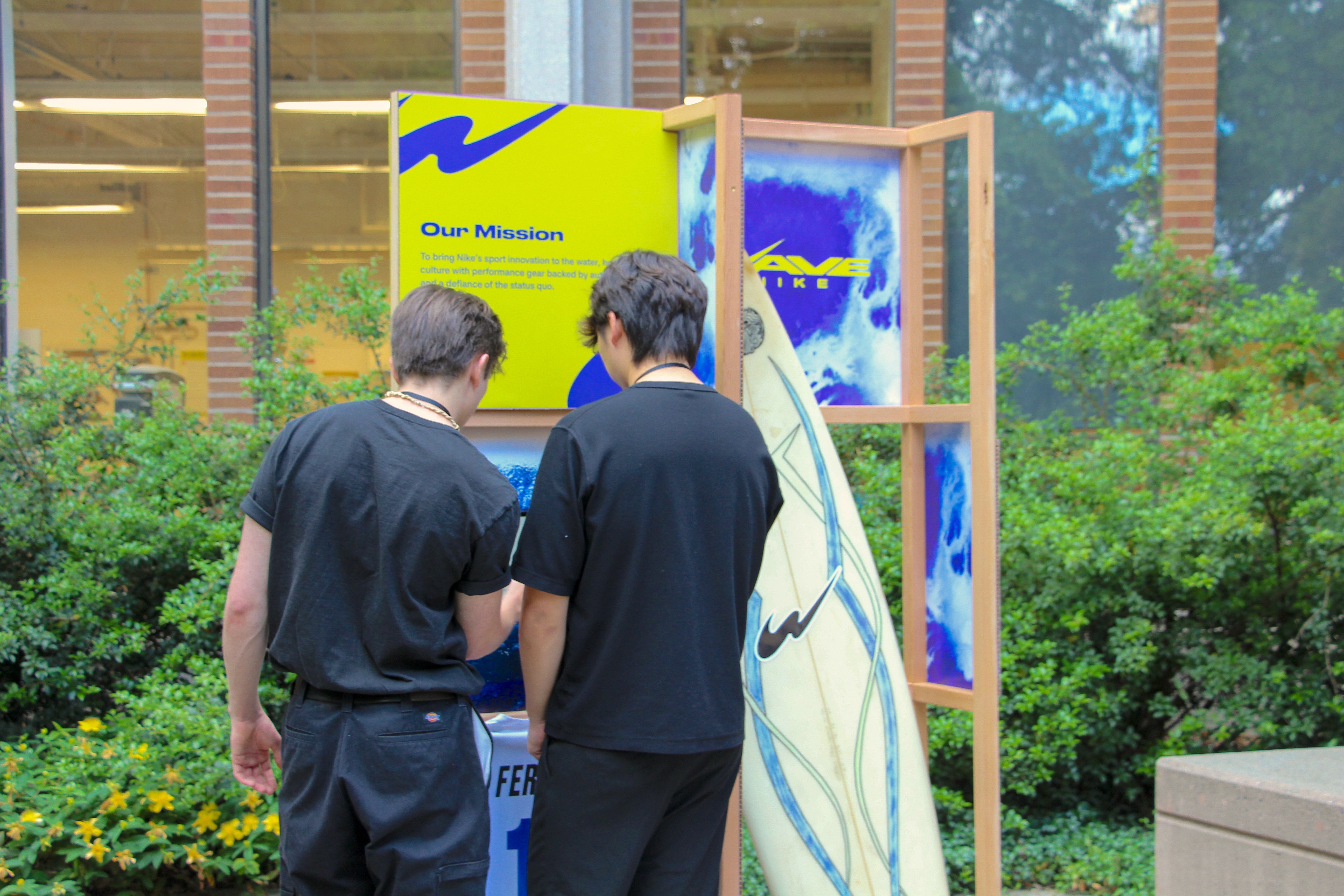
Nike Wave would launch Blue Label, giving a cut of every in-house sale straight back to the independent surf shop selling it. This initiative would help the sub-brand's exposure to local surfers while honoring existing surf culture.
brand system
After exploring a variety of logo directions, we found that distorting the Nike swoosh similar to how objects in water appear when light refracts gave a natural 'W' appearance and a unique symbol compared to the standard swoosh.

Combined logo

Combined logo

Final wordmark logo

pattern exploration
In staying true to the authentic nature of Nike Wave, we decided to use a more handcrafted approach in establishing our visual language. We found watercolor to be an excellent medium as it produced natural, organic forms while also being water-based, which was fitting for the aquatic nature of the sub-brand.
V1 (simple, concentrated areas of color)

V2 (layering colors, more complexity)

V3/Final (variety of blue concentrations)


print and production
As an employee of UW's on-campus workshop, I had the unique advantage of being able to use equipment during after-hours, allowing us to explore a variety of production techniques, including embroidery, vinyl sticker making, and heat transfer.


takeaways
The time my project partner, Brian, and I spent researching whether this project could exist as a future sub-brand of Nike gave the project real stakes and gave us a mission. Additionally, feedback from former Nike creative executives, Julie Igarashi and Howard Lichter encouraged us to explore a wide array of production techniques which helped us with extending the visual identity. Overall, I am incredibly proud of the work we were able to accomplish in a short period and would love to see Nike pursue something similar in the future.