Nike App Refresh
A UI update for Nike's consumer app designed to improve navigation and help unify the existing design system based on shopper feedback.
Timeline
6 weeks
Team
Kai Barnum
Roles
UI/UX Design
Motion Design
Visual Design
Tools
Figma
Photoshop
User Research
I personally assisted customers through the process of both downloading the Nike app as well as onboarding steps including account creation. As customers were guided, I prompted them with a question. Before letting customers leave the store, I would always make sure to ask the following:
“Do you feel comfortable navigating the Nike app on your own?”
“If not, what about your experience was challenging or confusing?”
Key Insights
After gathering data from customers for over two months as a Nike cashier, I noticed a few key patterns in the challenges that my customers were facing when opening the Nike app and/or downloading it for the first time.
Buttons lacked intuitive functionality when customers were connecting with a Nike cashier resulting in frequent mistakes where they would click the scan button instead of the pass button to get to the Nike Pass screen.
Minimal engagement between 'Interests' and 'Following' sections within the app. Item and content recommendations lacked personalization.
Visual language of icons lacked consistency between the in-store mode and profile page resulting in unnecessary confusion for the user.
'New from Nike' tab disconnected 'Recommended Products' tab from the products related to the user's interests.
Action Statement
How might we simplify in-app navigation while catering to user interests in order to improve the overall shopping experience for Nike app users?
Information Architecture
In laying out the information architecture, I wanted to prioritize a clear and straightforward navigation. Instead of five navigation menu items, it would be limited to four to reduce cognitive overload. The new events tab would host the user's registered events and their details and would become a more prominent feature within the app to boost future engagement with Nike-sponsored events.

Early Wireframing
In early wireframing, I made sure that the user flow did not stray too far from the current app. A few of my big changes included making the login screen have an itemized list for the app's purpose rather than a paragraph and streamlining the orders screen. Additionally, improving the hierarchy on the profile page was a consideration.

App Icon Set
While redesigning many of the Nike app's UI, there were several icons in the current app that felt out of place. The shop icon in the navigation bar felt out of place and confusing especially given that there was already a search icon at the top of the screen for searching for products. Because of this, I ultimately found myself redesigning several as well as adding a few of my own. Overall, I maintained a consistent visual language across my icon set using mostly organic forms.

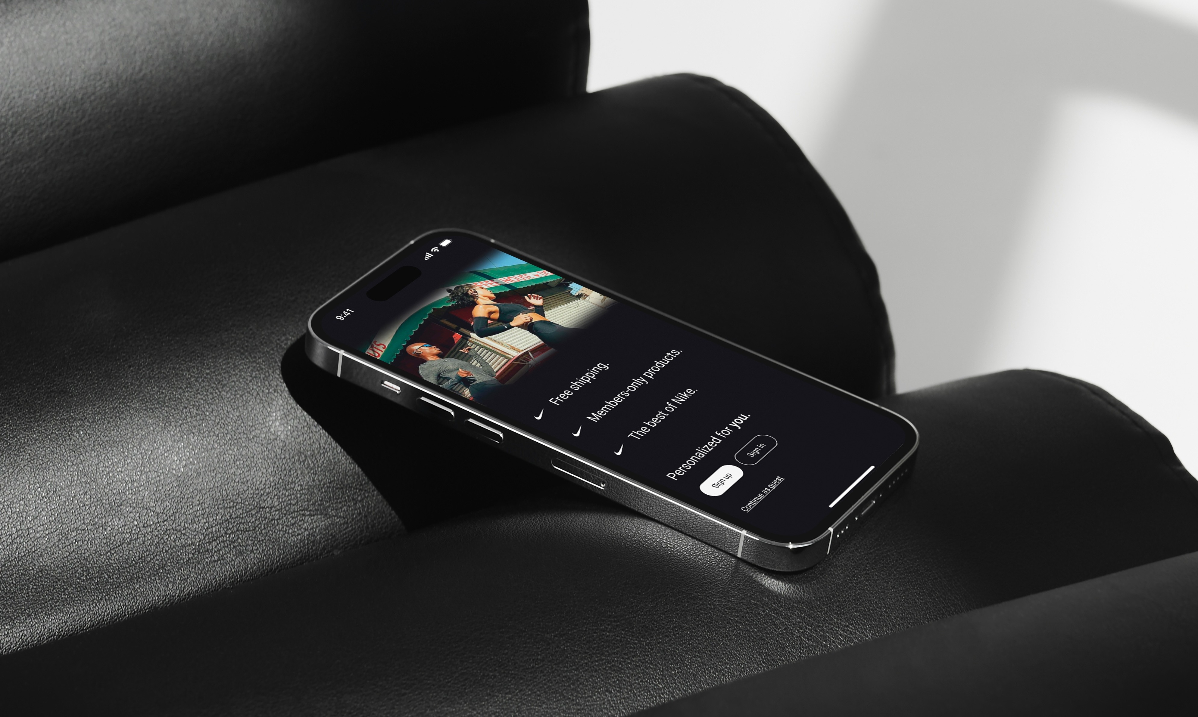
Login/Sign-up
Information was poorly listed and organized resulting in customers often asking what purpose the app served in their shopping experience.
Text overlayed on the image can create slight visual tension and potential accessibility issues.

My Solution
Implemented a bulleted list highlighting several of the app's key features.
Integrated motion to highlight each of the app's features one at a time to reduce cognitive overload.
Divided the text and image more clearly to improve readability for users.
Home
Store address was confusing and users would frequently ask us what kind of a Nike store we were.
'Open' button had accessibility issues on the dark background.
Users were unclear on how products were being recommended.
'Favorites' and 'Bag' cluttered the navigation bar for only being small features.
'Shop' magnifying glass icon feels redundant considering a search icon already exists on the home screen.

Solution
Nike store type specified and address fully typed out.
Added a white fill to the 'Open' button to improve contrast and visibility.
Connected recommended products to user interests.
Grouped the 'Bag' with the top corner search and 'Favorites' to the 'Profile' tab to increase personalization within the profile page.
Implemented a shopping cart icon and an events tab to the navigation bar to boost engagement with events.
User Profile
The 'Edit Profile' button was bold and high up in the visual hierarchy, despite most users looking for their orders or Nike Pass while in the store.
User orders were difficult to find.
'Nike Pass' was named differently elsewhere in the app.
Events were difficult to find in the profile tab.
Users often did not remember who they were following (term was confusing).

Solution
Reduced contrast on the 'Edit Profile' button to help ease the user flow.
Swapped 'Orders with the 'Inbox' to improve visibility as the 'Orders' feature was utilized more often.
Specified the Nike pass icon
Shifted 'Rewards' with 'Favorites' and added a giftbox to 'Rewards' to motivate users to click.
Adjusted the 'Following' language to match the onboarding question which asked about user interests.
Nike Orders
Title felt impersonal and did not match the language of the rest of the app.
Orders were listed out item by item making navigation complex and cluttered.
Lines were not visually consistent with other parts of the app.

Solution
Adjusted the impersonal tone to match the personalized language of the rest of the app and improve unity
Chronologically organized the section by order so users can click into orders to view all items within the order; "buy again" removed until user clicks into nested view.
Extended the lines that divided orders to the end of the page to better match the app's visual language.
Reflection
I feel extremely proud to have tackled such a complex project in such a limited time while also working a full-time job. Here are some of my key takeaways:
In supporting customer app downloads every workday, I was able to learn how to analyze user flow challenges across various user groups.
I enhanced my understanding of the UX design process by conducting user research firsthand with real users of the platform.
The project allowed me to explore what it was like to solve a real-world user experience challenge for a global organization.
Interactive Prototype
Tip: I would highly encourage maximizing the screen to improve the wireframe's navigation!